
 Winter Home Cleaning Booking App Interface Prompt
 Winter heating goods price comparison app interface prompt
 Winter warm economy warm goods recommendation app interface prompt
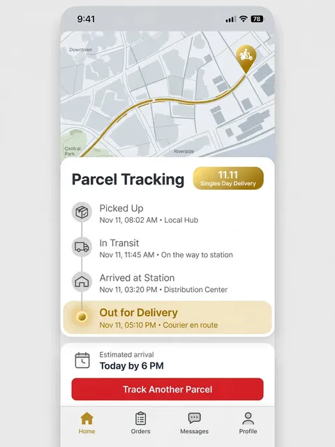 Singles Day parcel tracking app interface prompt
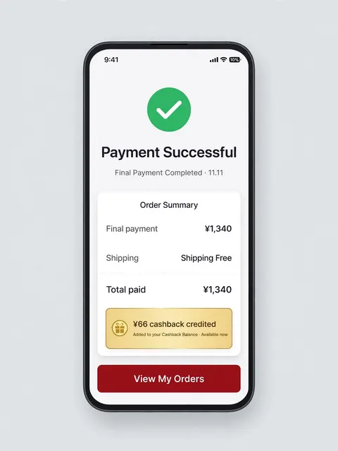 Singles Day final payment success app interface prompt
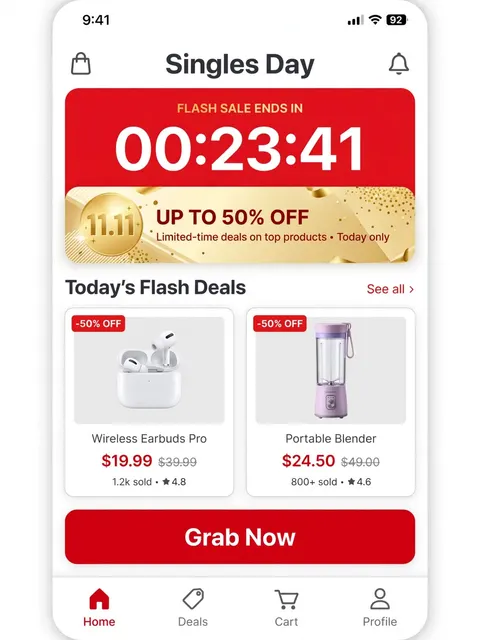 Singles Day flash sale countdown app interface prompt
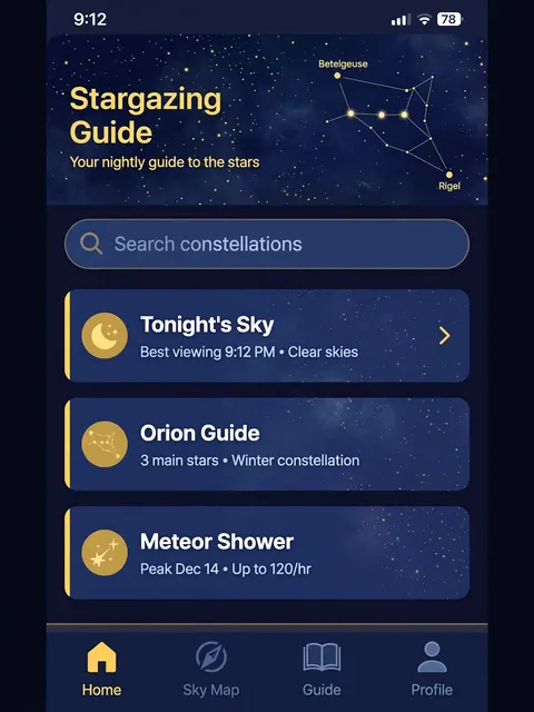 Stargazing guide app interface under a winter night sky prompt
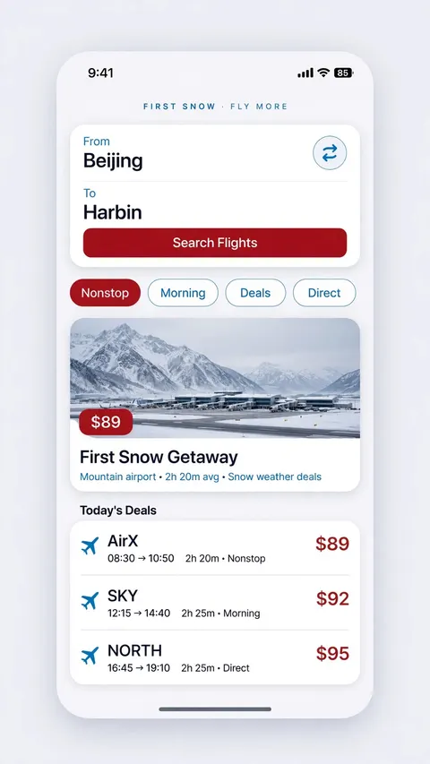 First snow flight deals booking app interface prompt
