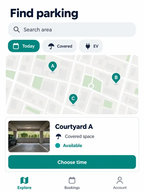
 Shared Parking Space Booking Mobile UI Screenshot Prompt
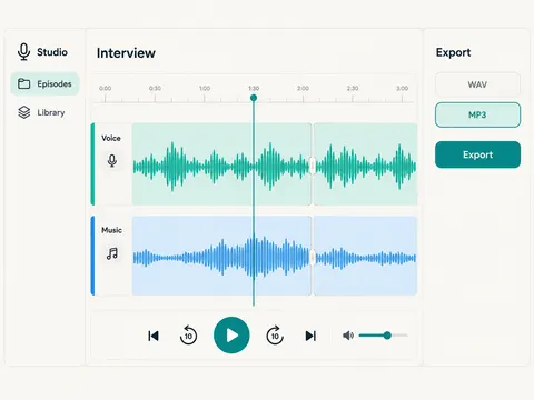 Podcast Editing Workspace Web UI Screenshot Prompt
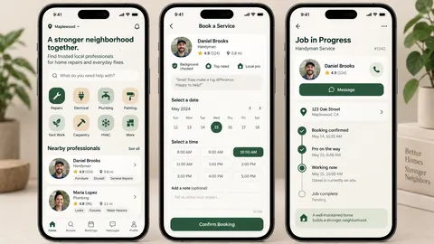 Neighborhood Repair Booking App UI Prompt
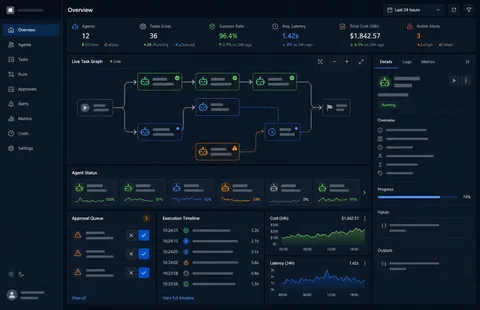 AI Agent Operations Dashboard UI Design Prompt
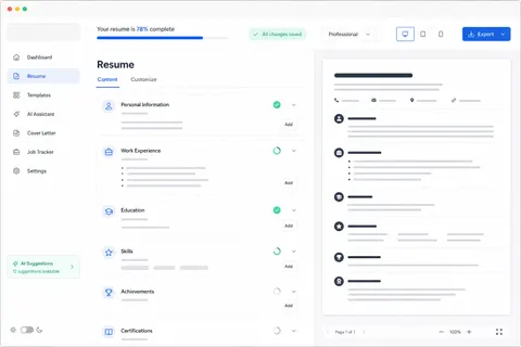 AI Resume Builder Web Application UI Design Prompt
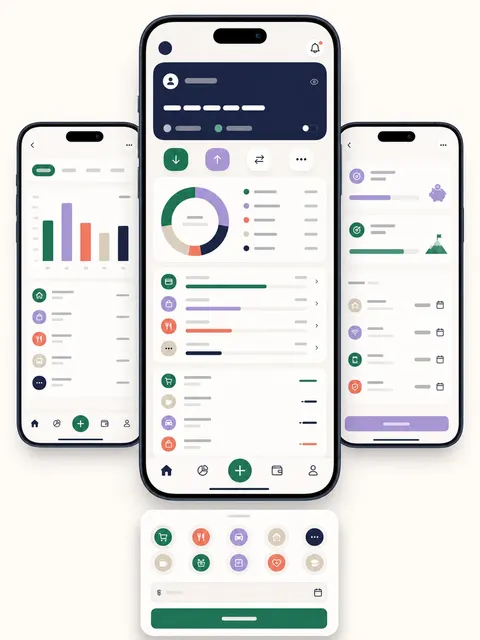 Personal Finance Expense Tracker App UI Prompt
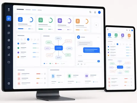 AI Study Assistant App Interface Design Prompt
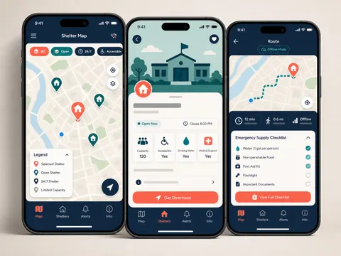 Community Emergency Shelter Map Mobile App UI Prompt